environment Maps
18 geographic visualizations tagged with "environment"
![[OC] See how your county is changing due to climate change Visualization](/api/images/reddit-maps/1sx2vjh_1777298401093.jpg "[OC] See how your county is changing due to climate change Visualization")
[OC] See how your county is changing due to climate change Visualization
This data visualization displays "[OC] See how your county is changing due to climate change" and provides a clear visua...
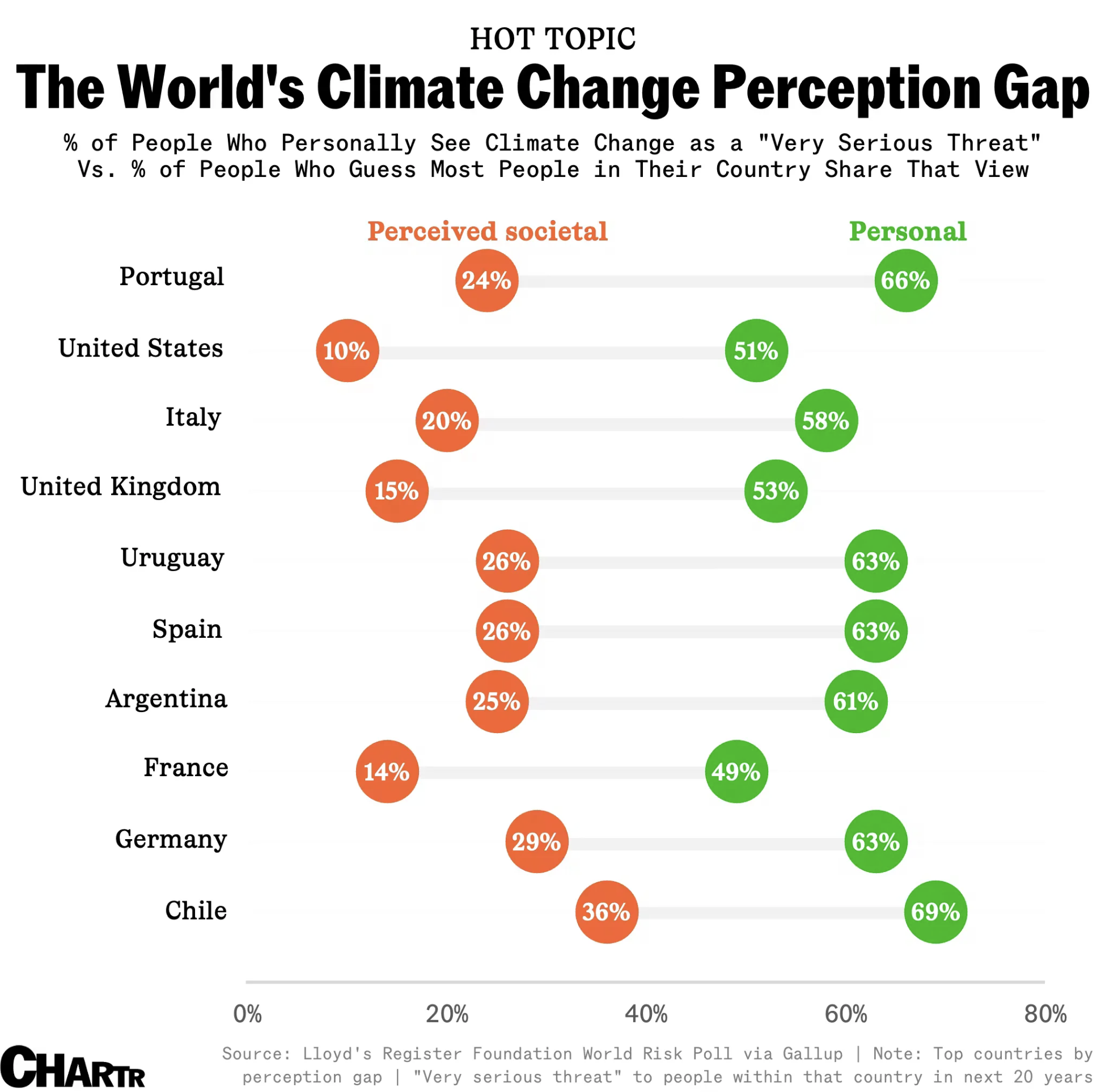
Over 50% of Americans say climate change is a serious threat; only 10% think their compatriots feel the same Visualization
This data visualization displays "Over 50% of Americans say climate change is a serious threat; only 10% think their com...
![[OC] The seasons are shifting across all climate zones as global temperatures rise Visualization](/api/images/reddit-maps/1u2xhcu_1781193603312.jpg "[OC] The seasons are shifting across all climate zones as global temperatures rise Visualization")
[OC] The seasons are shifting across all climate zones as global temperatures rise Visualization
This data visualization displays "[OC] The seasons are shifting across all climate zones as global temperatures rise" an...
![[OC] In 2025, clean energy investment ($2.1T) was 33× larger than global climate adaptation funding ($63B), while weather disasters cost $380B Visualization](/api/images/reddit-maps/1tku716_1779487203450.jpg "[OC] In 2025, clean energy investment ($2.1T) was 33× larger than global climate adaptation funding ($63B), while weather disasters cost $380B Visualization")
[OC] In 2025, clean energy investment ($2.1T) was 33× larger than global climate adaptation funding ($63B), while weather disasters cost $380B Visualization
This data visualization displays "[OC] In 2025, clean energy investment ($2.1T) was 33× larger than global climate adapt...
![[OC] I mapped how every country addresses transport in their climate commitments - here's what the regional patterns look like Visualization](/api/images/reddit-maps/1u81afb_1781676002023.jpg "[OC] I mapped how every country addresses transport in their climate commitments - here's what the regional patterns look like Visualization")
[OC] I mapped how every country addresses transport in their climate commitments - here's what the regional patterns look like Visualization
This data visualization displays "[OC] I mapped how every country addresses transport in their climate commitments - her...
![[OC] US Environmental Risk Heatmap — 3,146 counties scored from FEMA, USGS, and EPA data Statistics](/api/images/reddit-maps/1t96yh3_1778421601898.jpg "[OC] US Environmental Risk Heatmap — 3,146 counties scored from FEMA, USGS, and EPA data Statistics")
[OC] US Environmental Risk Heatmap — 3,146 counties scored from FEMA, USGS, and EPA data Statistics
This data visualization displays "[OC] US Environmental Risk Heatmap — 3,146 counties scored from FEMA, USGS, and EPA da...
![[OC] In favor of microclimate diversity Visualization](/api/images/reddit-maps/1t49oof_1777975201042.jpg "[OC] In favor of microclimate diversity Visualization")
[OC] In favor of microclimate diversity Visualization
This data visualization displays "[OC] In favor of microclimate diversity" and provides a clear visual representation of...