"The Mother of All Deals": EU and India are on the cusp of a historic FTA that would create a market of 2 billion people. Here is a breakdown of their current trade relationship. Visualization
Data Analysis
What This Visualization Shows
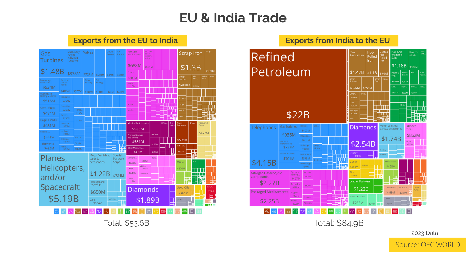
This data visualization displays ""The Mother of All Deals": EU and India are on the cusp of a historic FTA that would create a market of 2 billion people. Here is a breakdown of their current trade relationship." and provides a clear visual representation of the underlying data patterns and trends. The visualization focuses on European Commission President Ursula von der Leyen didn’t mince words at Davos this week. While acknowledging that work remains, she announced that the EU and India are now "on the cusp" of a historic free trade agreement, a pact she described as the "mother of all deals."
This agreement would effectively link a combined market of two billion people, representing nearly a quarter of the global GDP. With von der Leyen expected to visit India early next week to push the negotiations over the line, the geopolitical goal is clear: the EU wants to diversify its supply chains and reduce reliance on single-source actors.
**A Trade Relationship Defined by Contrast**
If you look at the 2023 trade data, the current relationship tells a fascinating story of how these two economies interact. It is a trade balance defined by high-tech engineering flowing East, and energy and consumer goods flowing West.
On the European side, exports to India are dominated by heavy industry and aerospace. The single largest category is "Planes, Helicopters, and Spacecraft" ($5.19B), followed by gas turbines and machinery. Essentially, India is buying the infrastructure to modernize its transport and energy sectors.
In return, India is sending a mix of new-age tech and critical commodities. While there is a significant $4.15B flow of telephones, signaling India’s rising status as a mobile manufacturing hub, the relationship is overwhelmingly anchored by one massive commodity: **Refined Petroleum.**
India's largest trade partner in Europe right now isn't the industrial powerhouse of Germany, nor is it France. **It is the Netherlands.**
The Dutch-India trade volume hit $22.5 billion in 2023, eclipsing Germany ($13.6 billion) and Italy ($9.85 billion). This isn't driven by consumer goods, but by energy security. Of that volume, a staggering $15 billion was refined petroleum.
**Looking Ahead**
As von der Leyen lands in New Delhi next week, the goal will be to expand this relationship beyond just swapping oil for airplanes. If the "mother of all deals" goes through, we will likely see these charts shift significantly, moving toward a deeper integration of services, digital trade, and green technology manufacturing.
Trade data: [https://oec.world/en/profile/international\_organization/eu?selector173id=importOption](https://oec.world/en/profile/international_organization/eu?selector173id=importOption), which allows us to understand complex relationships and insights within the data through visual storytelling.
Deep Dive into the Topic
This data visualization represents a sophisticated analysis of complex information patterns that provide valuable insights into underlying trends and relationships. Data visualization serves as a bridge between raw numerical data and human understanding, transforming abstract statistics into comprehensible visual narratives.
The power of data visualization lies in its ability to reveal patterns, outliers, and correlations that might not be apparent in traditional tabular formats. Through careful selection of chart types, color schemes, and interactive elements, effective visualizations can communicate complex information quickly and accurately to diverse audiences.
Modern data visualization combines statistical analysis with design principles to create compelling visual stories. This interdisciplinary approach requires understanding both the underlying data and the cognitive processes involved in visual perception. The result is more effective communication of quantitative insights that can inform decision-making and drive positive change.
Data Analysis and Insights
The patterns revealed in this visualization demonstrate the importance of systematic data analysis in understanding complex phenomena. By examining different data segments, time periods, and categorical breakdowns, we can identify trends that inform strategic planning and decision-making processes.
Statistical analysis of this data reveals variations across different dimensions that provide insights into underlying drivers and relationships. These patterns help identify areas of opportunity, potential risks, and key performance indicators that can guide future actions and resource allocation.
The analytical approach used in this visualization enables comparison across different categories, time periods, or geographic regions, revealing insights that support evidence-based decision-making. This type of analysis is essential for organizations seeking to optimize performance and understand complex market dynamics.
Significance and Applications
This data visualization has important implications for understanding trends and patterns that affect decision-making across multiple sectors. The insights derived from this analysis can inform policy development, business strategy, resource allocation, and operational improvements.
For analysts, researchers, and decision-makers, this type of data visualization provides essential insights for strategic planning and performance optimization. Whether addressing operational challenges, market analysis, or policy development, understanding data patterns helps create more effective strategies and solutions.
The broader significance lies in how this information contributes to our understanding of complex systems and relationships. This knowledge helps predict future trends, identify potential challenges, and develop more informed approaches to problem-solving and opportunity identification.
Comments
Loading comments...
Leave a Comment
About the Author

Alex Cartwright
Senior Data Visualization Expert
Alex Cartwright is a renowned data visualization specialist and infographic designer with over 15 years of experience in...