The UK is seeking a trade deal with China. What does trade between the two countries look like? Visualization
Data Analysis
What This Visualization Shows
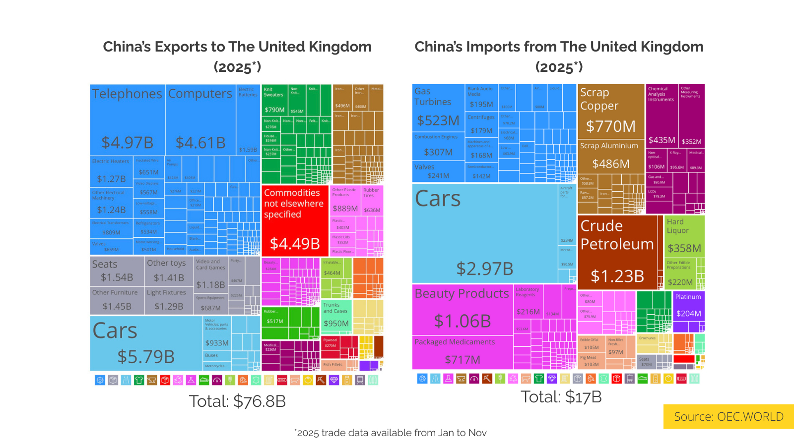
This data visualization displays "The UK is seeking a trade deal with China. What does trade between the two countries look like?" and provides a clear visual representation of the underlying data patterns and trends. The visualization focuses on Prime Minister Keir Starmer travels to China this Tuesday to discuss trade and investment, a visit that comes amid significant economic imbalances and shifting diplomatic pressures. The primary driver for the UK side appears to be the widening trade gap between the two nations. Data from January to November 2025 shows that China exported $76.8 billion worth of goods to the United Kingdom, while British exports to China totaled $17 billion during the same period.
This creates a trade deficit of roughly $60 billion. The composition of this trade highlights the UK's reliance on Chinese manufacturing for consumer technology and transport, specifically cars, telephones, and computers, which accounted for approximately 20% of total imports from China. In contrast, the UK’s export volume is significantly lower, with cars and crude petroleum being the primary contributors.
The timing of the visit is notable given the United States' current stance on its allies' trade policies. The negotiations are under scrutiny following recent comments from Donald Trump, who threatened to impose 100% tariffs on Canada if Prime Minister Mark Carney finalized a trade deal with Beijing. This precedent suggests the UK is attempting to balance the need to address its trade deficit with China with the risk of retaliatory tariffs from the US.
Trade Data Source: [https://oec.world/en/profile/country/chn?selector335id=HS4&selector303id=Year&selector1878id=percentage&selector320id=2](https://oec.world/en/profile/country/chn?selector335id=HS4&selector303id=Year&selector1878id=percentage&selector320id=2)
News source: [https://www.nytimes.com/2026/01/27/world/europe/uk-china-visit-starmer-trade.html](https://www.nytimes.com/2026/01/27/world/europe/uk-china-visit-starmer-trade.html), which allows us to understand complex relationships and insights within the data through visual storytelling.
Deep Dive into the Topic
This data visualization represents a sophisticated analysis of complex information patterns that provide valuable insights into underlying trends and relationships. Data visualization serves as a bridge between raw numerical data and human understanding, transforming abstract statistics into comprehensible visual narratives.
The power of data visualization lies in its ability to reveal patterns, outliers, and correlations that might not be apparent in traditional tabular formats. Through careful selection of chart types, color schemes, and interactive elements, effective visualizations can communicate complex information quickly and accurately to diverse audiences.
Modern data visualization combines statistical analysis with design principles to create compelling visual stories. This interdisciplinary approach requires understanding both the underlying data and the cognitive processes involved in visual perception. The result is more effective communication of quantitative insights that can inform decision-making and drive positive change.
Data Analysis and Insights
The patterns revealed in this visualization demonstrate the importance of systematic data analysis in understanding complex phenomena. By examining different data segments, time periods, and categorical breakdowns, we can identify trends that inform strategic planning and decision-making processes.
Statistical analysis of this data reveals variations across different dimensions that provide insights into underlying drivers and relationships. These patterns help identify areas of opportunity, potential risks, and key performance indicators that can guide future actions and resource allocation.
The analytical approach used in this visualization enables comparison across different categories, time periods, or geographic regions, revealing insights that support evidence-based decision-making. This type of analysis is essential for organizations seeking to optimize performance and understand complex market dynamics.
Significance and Applications
This data visualization has important implications for understanding trends and patterns that affect decision-making across multiple sectors. The insights derived from this analysis can inform policy development, business strategy, resource allocation, and operational improvements.
For analysts, researchers, and decision-makers, this type of data visualization provides essential insights for strategic planning and performance optimization. Whether addressing operational challenges, market analysis, or policy development, understanding data patterns helps create more effective strategies and solutions.
The broader significance lies in how this information contributes to our understanding of complex systems and relationships. This knowledge helps predict future trends, identify potential challenges, and develop more informed approaches to problem-solving and opportunity identification.
Comments
Loading comments...
Leave a Comment
About the Author

Alex Cartwright
Senior Data Visualization Expert
Alex Cartwright is a renowned data visualization specialist and infographic designer with over 15 years of experience in...