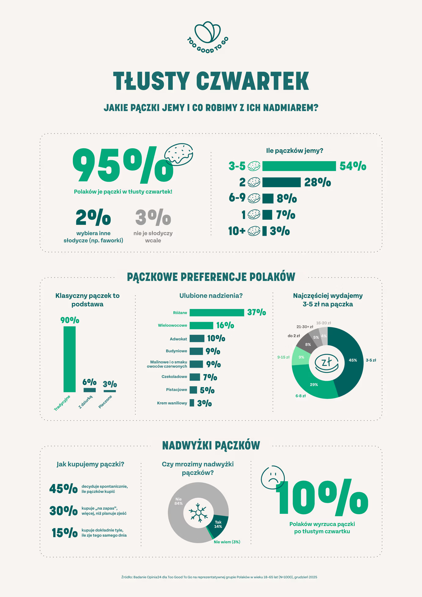
Today's Fat Thursday in Poland! An Infographic (Translation in text)
Data Analysis
What This Visualization Shows
This data visualization displays "Today's Fat Thursday in Poland! An Infographic (Translation in text)" and provides a clear visual representation of the underlying data patterns and trends. The visualization focuses on Tłusty czwartek – Fat Thursday
Jakie pączki jemy i co robimy z ich nadmiarem? – What kind of doughnuts do we eat and what do we do with the leftovers?
95% Polaków je pączki w tłusty czwartek! – 95% of Poles eat doughnuts on Fat Thursday!
2% wybiera inne słodycze (np. faworki) – 2% choose other sweets (e.g., angel wings)
3% nie je słodyczy wcale – 3% do not eat sweets at all
Ile pączków jemy? – How many doughnuts do we eat?
Pączkowe preferencje Polaków (Doughnut preferences of Poles)
Klasyczny pączek to podstawa – The classic doughnut is the staple
90% Tradycyjne – 90% Traditional
6% Z dziurką – 6% With a hole (Donuts)
3% Pieczone – 3% Baked
Ulubione nadzienia? – Favorite fillings?
Różane: 37% – Rose: 37%
Wieloowocowe: 16% – Mixed fruit: 16%
Adwokat: 10% – Advocaat (Egg liqueur): 10%
Budyniowe: 9% – Custard/Pudding: 9%
Malinowe i o smaku owoców czerwonych: 9% – Raspberry and red fruit flavor: 9%
Czekoladowe: 7% – Chocolate: 7%
Pistacjowe: 5% – Pistachio: 5%
Krem waniliowy: 3% – Vanilla cream: 3%
Najczęściej wydajemy 3-5 zł na pączka – We most often spend 3-5 PLN per doughnut
Nadwyżki pączków (Doughnut surpluses)
Jak kupujemy pączki? – How do we buy doughnuts?
45% decyduje spontanicznie, ile pączków kupić – 45% decide spontaneously how many doughnuts to buy
30% kupuje „na zapas”, więcej, niż planuje zjeść – 30% buy "in reserve", more than they plan to eat
15% kupuje dokładnie tyle, ile zje tego samego dnia – 15% buy exactly as many as they will eat the same day
Czy mrozimy nadwyżki pączków? – Do we freeze doughnut surpluses?
Nie: 84% – No: 84%
Tak: 14% – Yes: 14%
Nie wiem: 2% – I don't know: 2%
10% Polaków wyrzuca pączki po tłustym czwartku – 10% of Poles throw away doughnuts after Fat Thursday, which allows us to understand complex relationships and insights within the data through visual storytelling.
Deep Dive into the Topic
This data visualization represents a sophisticated analysis of complex information patterns that provide valuable insights into underlying trends and relationships. Data visualization serves as a bridge between raw numerical data and human understanding, transforming abstract statistics into comprehensible visual narratives.
The power of data visualization lies in its ability to reveal patterns, outliers, and correlations that might not be apparent in traditional tabular formats. Through careful selection of chart types, color schemes, and interactive elements, effective visualizations can communicate complex information quickly and accurately to diverse audiences.
Modern data visualization combines statistical analysis with design principles to create compelling visual stories. This interdisciplinary approach requires understanding both the underlying data and the cognitive processes involved in visual perception. The result is more effective communication of quantitative insights that can inform decision-making and drive positive change.
Data Analysis and Insights
The patterns revealed in this visualization demonstrate the importance of systematic data analysis in understanding complex phenomena. By examining different data segments, time periods, and categorical breakdowns, we can identify trends that inform strategic planning and decision-making processes.
Statistical analysis of this data reveals variations across different dimensions that provide insights into underlying drivers and relationships. These patterns help identify areas of opportunity, potential risks, and key performance indicators that can guide future actions and resource allocation.
The analytical approach used in this visualization enables comparison across different categories, time periods, or geographic regions, revealing insights that support evidence-based decision-making. This type of analysis is essential for organizations seeking to optimize performance and understand complex market dynamics.
Significance and Applications
This data visualization has important implications for understanding trends and patterns that affect decision-making across multiple sectors. The insights derived from this analysis can inform policy development, business strategy, resource allocation, and operational improvements.
For analysts, researchers, and decision-makers, this type of data visualization provides essential insights for strategic planning and performance optimization. Whether addressing operational challenges, market analysis, or policy development, understanding data patterns helps create more effective strategies and solutions.
The broader significance lies in how this information contributes to our understanding of complex systems and relationships. This knowledge helps predict future trends, identify potential challenges, and develop more informed approaches to problem-solving and opportunity identification.
Comments
Loading comments...
Leave a Comment
About the Author

Alex Cartwright
Senior Data Visualization Expert
Alex Cartwright is a renowned data visualization specialist and infographic designer with over 15 years of experience in...