Total Access: Indonesia opens 99% of its market to the US in a historic reciprocity deal Visualization
Data Analysis
What This Visualization Shows
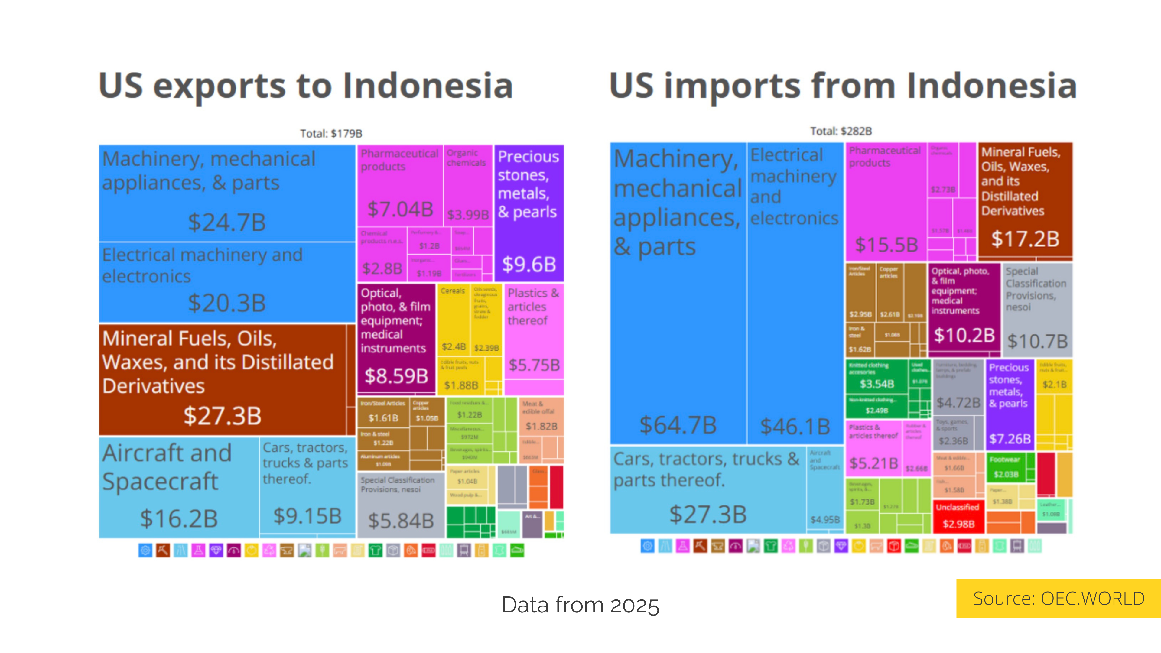
This data visualization displays "Total Access: Indonesia opens 99% of its market to the US in a historic reciprocity deal" and provides a clear visual representation of the underlying data patterns and trends. The visualization focuses on In 2025, bilateral trade between the United States and Indonesia reached a considerable scale: the US exported $179B to Indonesia, while importing $282B from that country, generating a trade deficit of approximately $103B in favor of Indonesia. This imbalance was the main driver that led both countries to negotiate, culminating in the agreement signed on February 19, 2026, which reduced US tariffs on Indonesian products from 32% to 19%.
On the exporting side, the US sends primarily industrial and energy inputs to Indonesia. Mechanical machinery and parts led with $24.7B, followed by mineral fuels with $27.3B and electrical machinery with $20.3B. Aircraft and spacecraft contributed $16.2B and pharmaceuticals $7.04B. Consistent with this, within the agreement, Indonesian companies committed to purchasing 1 million tons of soybeans, 1.6 million tons of corn, and 93,000 tons of US cotton, in addition to up to 5 million tons of wheat by 2030, categories that already appear as part of the US export flow to Indonesia.
On the Indonesian side, exports to the US show a clear concentration in manufacturing. Mechanical machinery and parts led with $64.7B, followed by electrical and electronic machinery with $46.1B and vehicles and parts with $27.3B. Footwear, textiles, and apparel, sectors that directly employ between 4 and 5 million Indonesian workers, also figure in the export flow and were the subject of specific negotiation, obtaining exemptions and zero-tariff quotas within the agreement.
Indonesia committed to eliminating tariffs for 99% of US products, a gesture that expands access to the fourth most populous country in the world. The exchange profile reflects two economies with real interdependencies: the US provides high-value-added inputs and agricultural commodities, while Indonesia supplies large-scale assembled manufacturing. The agreement, in that context, formalized a rebalancing between partners that were already trading significantly. The trade data was obtained from the Observatory of Economic Complexity (OEC).
Sources:
Trade Data: [https://oec.world/en/profile/country/usa?selector335id=HS2&selector303id=Year&selector320id=1&selector1878id=usd](https://oec.world/en/profile/country/usa?selector335id=HS2&selector303id=Year&selector320id=1&selector1878id=usd)
News: [https://www.infobae.com/america/mundo/2026/02/20/eeuu-e-indonesia-anunciaron-un-acuerdo-comercial-que-incluye-compras-por-usd-33000-millones/](https://www.infobae.com/america/mundo/2026/02/20/eeuu-e-indonesia-anunciaron-un-acuerdo-comercial-que-incluye-compras-por-usd-33000-millones/), which allows us to understand complex relationships and insights within the data through visual storytelling.
Deep Dive into the Topic
This data visualization represents a sophisticated analysis of complex information patterns that provide valuable insights into underlying trends and relationships. Data visualization serves as a bridge between raw numerical data and human understanding, transforming abstract statistics into comprehensible visual narratives.
The power of data visualization lies in its ability to reveal patterns, outliers, and correlations that might not be apparent in traditional tabular formats. Through careful selection of chart types, color schemes, and interactive elements, effective visualizations can communicate complex information quickly and accurately to diverse audiences.
Modern data visualization combines statistical analysis with design principles to create compelling visual stories. This interdisciplinary approach requires understanding both the underlying data and the cognitive processes involved in visual perception. The result is more effective communication of quantitative insights that can inform decision-making and drive positive change.
Data Analysis and Insights
The patterns revealed in this visualization demonstrate the importance of systematic data analysis in understanding complex phenomena. By examining different data segments, time periods, and categorical breakdowns, we can identify trends that inform strategic planning and decision-making processes.
Statistical analysis of this data reveals variations across different dimensions that provide insights into underlying drivers and relationships. These patterns help identify areas of opportunity, potential risks, and key performance indicators that can guide future actions and resource allocation.
The analytical approach used in this visualization enables comparison across different categories, time periods, or geographic regions, revealing insights that support evidence-based decision-making. This type of analysis is essential for organizations seeking to optimize performance and understand complex market dynamics.
Significance and Applications
This data visualization has important implications for understanding trends and patterns that affect decision-making across multiple sectors. The insights derived from this analysis can inform policy development, business strategy, resource allocation, and operational improvements.
For analysts, researchers, and decision-makers, this type of data visualization provides essential insights for strategic planning and performance optimization. Whether addressing operational challenges, market analysis, or policy development, understanding data patterns helps create more effective strategies and solutions.
The broader significance lies in how this information contributes to our understanding of complex systems and relationships. This knowledge helps predict future trends, identify potential challenges, and develop more informed approaches to problem-solving and opportunity identification.
Comments
Loading comments...
Leave a Comment
About the Author

Alex Cartwright
Senior Data Visualization Expert
Alex Cartwright is a renowned data visualization specialist and infographic designer with over 15 years of experience in...