Where do LLMs go for Answers? Visualization
Data Analysis
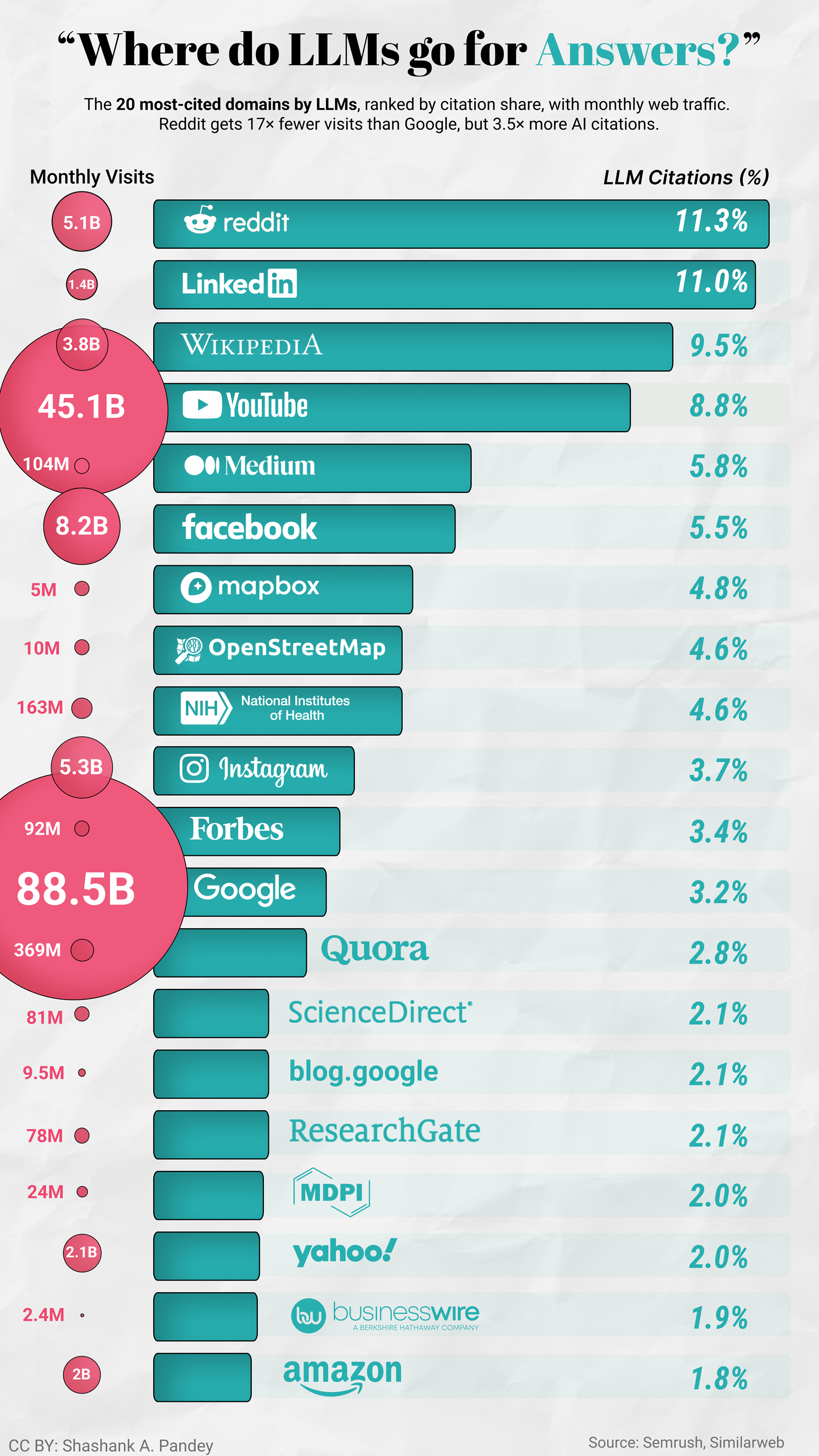
What This Visualization Shows
This data visualization displays "Where do LLMs go for Answers?" and provides a clear visual representation of the underlying data patterns and trends. The visualization focuses on Reddit and LinkedIn together hold 22% of all LLM citations. More than Wikipedia, YouTube, and NIH combined.
That's not random. "I tried both for six months and here's what broke" is a better training signal than a listicle. LLMs seem to weigh first-person experience heavily, which means the content SEO has historically undervalued is exactly what AI search favours.
The finding that caught me off guard: Mapbox and OpenStreetMap in the top 10. Neither is a content site. Both are geospatial infrastructures. My read is that this reflects AI agents increasingly needing to interact with the physical world: routing, geocoding, and location lookups. If that's right, LLM citation share might be one of the earliest visible signals of where agent tool-use is concentrating.
The other thing worth sitting with: four sites, NIH, ScienceDirect, ResearchGate, and MDPI, account for roughly 8.9% of total LLM citations. That's the entire academic and scientific credibility layer for AI systems making health and medicine claims. That's thin.
Worth keeping in mind that this describes maybe 5% of current search behaviour. Whether these patterns hold as adoption grows is genuinely unclear.
Data: [https://www.semrush.com/blog/linkedin-ai-visibility-study/](https://www.semrush.com/blog/linkedin-ai-visibility-study/), which allows us to understand complex relationships and insights within the data through visual storytelling.
Deep Dive into the Topic
This data visualization represents a sophisticated analysis of complex information patterns that provide valuable insights into underlying trends and relationships. Data visualization serves as a bridge between raw numerical data and human understanding, transforming abstract statistics into comprehensible visual narratives.
The power of data visualization lies in its ability to reveal patterns, outliers, and correlations that might not be apparent in traditional tabular formats. Through careful selection of chart types, color schemes, and interactive elements, effective visualizations can communicate complex information quickly and accurately to diverse audiences.
Modern data visualization combines statistical analysis with design principles to create compelling visual stories. This interdisciplinary approach requires understanding both the underlying data and the cognitive processes involved in visual perception. The result is more effective communication of quantitative insights that can inform decision-making and drive positive change.
Data Analysis and Insights
The patterns revealed in this visualization demonstrate the importance of systematic data analysis in understanding complex phenomena. By examining different data segments, time periods, and categorical breakdowns, we can identify trends that inform strategic planning and decision-making processes.
Statistical analysis of this data reveals variations across different dimensions that provide insights into underlying drivers and relationships. These patterns help identify areas of opportunity, potential risks, and key performance indicators that can guide future actions and resource allocation.
The analytical approach used in this visualization enables comparison across different categories, time periods, or geographic regions, revealing insights that support evidence-based decision-making. This type of analysis is essential for organizations seeking to optimize performance and understand complex market dynamics.
Significance and Applications
This data visualization has important implications for understanding trends and patterns that affect decision-making across multiple sectors. The insights derived from this analysis can inform policy development, business strategy, resource allocation, and operational improvements.
For analysts, researchers, and decision-makers, this type of data visualization provides essential insights for strategic planning and performance optimization. Whether addressing operational challenges, market analysis, or policy development, understanding data patterns helps create more effective strategies and solutions.
The broader significance lies in how this information contributes to our understanding of complex systems and relationships. This knowledge helps predict future trends, identify potential challenges, and develop more informed approaches to problem-solving and opportunity identification.
Comments
Loading comments...
Leave a Comment
About the Author

Alex Cartwright
Senior Data Visualization Expert
Alex Cartwright is a renowned data visualization specialist and infographic designer with over 15 years of experience in...