Anatomy of Greenland's trade and economy Visualization
Data Analysis
What This Visualization Shows
This data visualization displays "Anatomy of Greenland's trade and economy" and provides a clear visual representation of the underlying data patterns and trends. The visualization focuses on President Trump is doubling down on acquiring Greenland, citing national security and threatening tariffs on European allies opposing the idea.
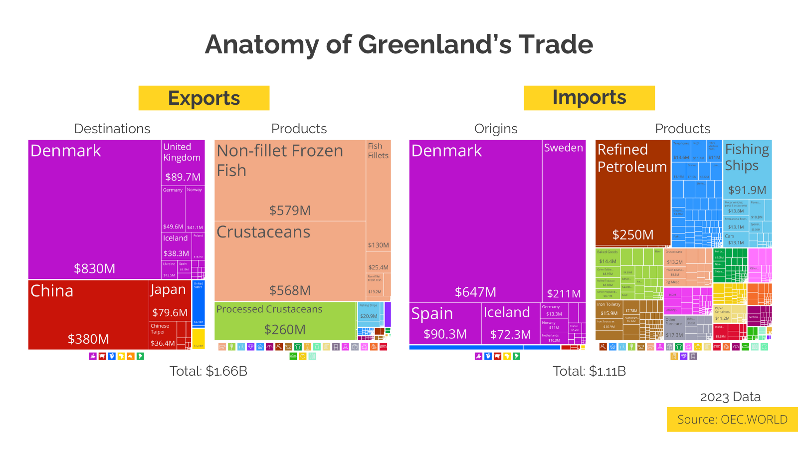
I went digging into their trade data to see if there was any economic leverage there, and the picture that emerges is of a relatively small, hyper-specialized fishing economy. Despite being the world's largest island, we are talking about a total export value of roughly $1.6 billion, with nearly 70% of that entire activity being frozen fish and crustaceans.
So, why the sudden, aggressive interest?
Part of it is speculative. As the ice sheet melts due to global warming, there is undoubtedly interest in what lies beneath: rare earth minerals, uranium, iron, and potentially oil and gas. However, Trump has been explicit that this is "national security, not minerals." He’s looking at Greenland and seeing a perfect location for missile early warning systems and vessel monitoring.
Currently, the United States has almost no direct economic leverage on the island. This likely explains why the strategy relies on political pressure against Denmark and other nations resistant to U.S. claims.
While Greenland does not possess an independent military, it is deeply integrated into NATO through Denmark. However, the Danish connection is not just about security; it is the island's economic lifeline. Denmark purchases 50% of Greenland's exports and supplies a staggering 58.5% of its imports.
The contrast with the U.S. is significant. Despite its geographic proximity, the U.S. accounts for just 0.54% of Greenland’s imports and only 1.68% of its exports.
Do you think the "national security" argument is strong enough to force NATO allies, or will these tariffs push Greenland and Denmark closer to the EU for protection?
Trade data source: [https://oec.world/en/profile/country/grl?selector343id=Import&selector1879id=usd](https://oec.world/en/profile/country/grl?selector343id=Import&selector1879id=usd), which allows us to understand complex relationships and insights within the data through visual storytelling.
Deep Dive into the Topic
This data visualization represents a sophisticated analysis of complex information patterns that provide valuable insights into underlying trends and relationships. Data visualization serves as a bridge between raw numerical data and human understanding, transforming abstract statistics into comprehensible visual narratives.
The power of data visualization lies in its ability to reveal patterns, outliers, and correlations that might not be apparent in traditional tabular formats. Through careful selection of chart types, color schemes, and interactive elements, effective visualizations can communicate complex information quickly and accurately to diverse audiences.
Modern data visualization combines statistical analysis with design principles to create compelling visual stories. This interdisciplinary approach requires understanding both the underlying data and the cognitive processes involved in visual perception. The result is more effective communication of quantitative insights that can inform decision-making and drive positive change.
Data Analysis and Insights
The patterns revealed in this visualization demonstrate the importance of systematic data analysis in understanding complex phenomena. By examining different data segments, time periods, and categorical breakdowns, we can identify trends that inform strategic planning and decision-making processes.
Statistical analysis of this data reveals variations across different dimensions that provide insights into underlying drivers and relationships. These patterns help identify areas of opportunity, potential risks, and key performance indicators that can guide future actions and resource allocation.
The analytical approach used in this visualization enables comparison across different categories, time periods, or geographic regions, revealing insights that support evidence-based decision-making. This type of analysis is essential for organizations seeking to optimize performance and understand complex market dynamics.
Significance and Applications
This data visualization has important implications for understanding trends and patterns that affect decision-making across multiple sectors. The insights derived from this analysis can inform policy development, business strategy, resource allocation, and operational improvements.
For analysts, researchers, and decision-makers, this type of data visualization provides essential insights for strategic planning and performance optimization. Whether addressing operational challenges, market analysis, or policy development, understanding data patterns helps create more effective strategies and solutions.
The broader significance lies in how this information contributes to our understanding of complex systems and relationships. This knowledge helps predict future trends, identify potential challenges, and develop more informed approaches to problem-solving and opportunity identification.
Comments
Loading comments...
Leave a Comment
About the Author

Alex Cartwright
Senior Data Visualization Expert
Alex Cartwright is a renowned data visualization specialist and infographic designer with over 15 years of experience in...