The data were obtained by performing calculations from the statistics on the website www.ine.es Instituto Nacional de Estadística (Spain). Statistics
Data Analysis
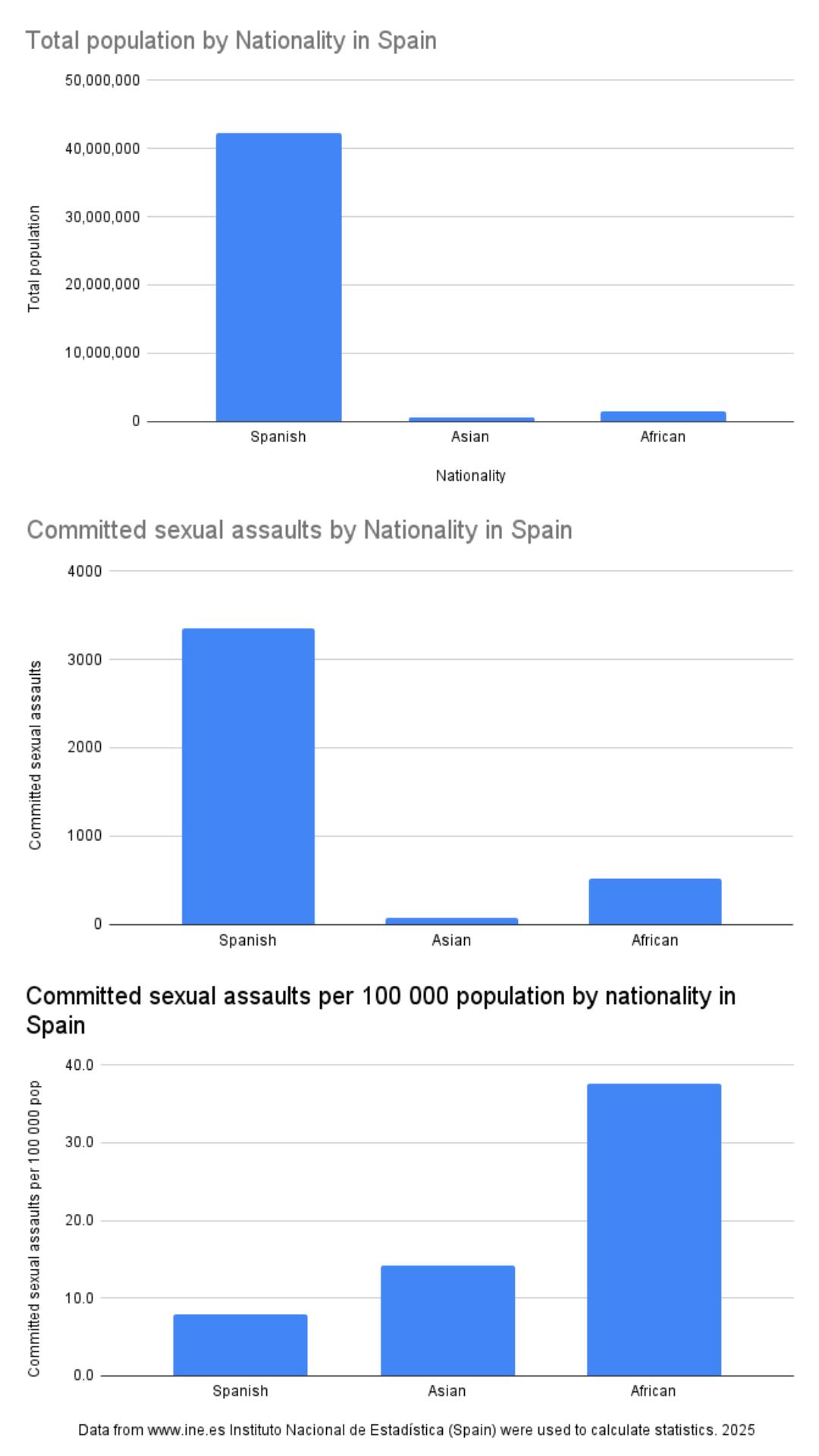
What This Visualization Shows
This data visualization displays "The data were obtained by performing calculations from the statistics on the website www.ine.es Instituto Nacional de Estadística (Spain)." and provides a clear visual representation of the underlying data patterns and trends. The visualization focuses on **What does it mean to be Spanish, Asian, or African?** The Instituto Nacional de Estadística allows you to group nationalities by continent. Asians and Africans are people who hold citizenship in Asia and Africa, respectively. A Spanish national is a citizen of Spain. If an Asian or African national receives Spanish citizenship, they are counted as Spanish in these statistics. These aren't ethnicities! They only reflect citizenship in this chart.
**Are these statistics falsified?** No, these statistics are collected by the National Institute of Estadística (Spain), and the data comes from police and court records, among other sources. Spanish police officers train for 5-10 years straight to pass the police exam. The level of falsification is very low and almost never occurs.
**The political context further precludes the possibility of falsifying statistics:** the Spanish government is led by an inclusive social democratic government that strives to provide protection for all people, and Spain will be one of the most accepted countries for immigrants in 2026. If these statistics were false, the Spanish government would make every effort to punish those who falsified them.
**Why aren't people from Oceania and the Americas included?** Population statistics and sexual crime statistics use different criteria for Oceania and the Americas, making it very difficult to compare which national groups are being considered, as the methods used in these two different data sets differ. Although Oceania is a relatively solvable problem, the total population of Oceania nationality is less than 6,000 people in all of Spain, so any crime doesn't accurately represent the group for 100 000 population statistics.
**Data Interpretation:** The main reasons for the statistical discrepancy remain controversial. They include the following ideas: Non-Spanish citizens have a more fragmented family structure, leading to higher levels of stress. There is also a major integration problem, where without knowledge of the language and Spanish culture, it becomes very difficult to integrate into the value chain and labor force. One rather controversial and radical idea also includes the explanation that victims of violence are more likely to report rape to the police if their perpetrator was not Spanish. Another controversial and radical idea is that police prefer to investigate sexual assault cases involving non-Spanish citizens because these cases are much easier to finish and the courts hand down convictions more often. But what about me? **I'm not an expert, I don't know. I have no opinion on this matter. I simply decided to publish these statistics. If there are any experts here in sociology and on the issues of Spain, I would be glad to hear your opinion on the reasons for the statistical gap.**
**Methodology:**
**1.** I used data on the population of Spanish, Asian and African nationality from the "Población residente por fecha, sexo, grupo de edad y nacionalidad 2025". [https://www.ine.es/jaxiT3/Datos.htm?t=56936#\_tabs-grafico](https://www.ine.es/jaxiT3/Datos.htm?t=56936#_tabs-grafico)
**2.** I used data on the number of sexual crimes by nationality of Spanish, Asian, African from - "Delitos sexuales según nacionalidad 2024" [https://www.ine.es/jaxiT3/Datos.htm?t=28716](https://www.ine.es/jaxiT3/Datos.htm?t=28716) ( To see the divisions by nationality on the continents, you need to click on the gear in the right corner and select nationalities by continent in the table (the interface is very unfriendly, the link is not copyable )
**3.** To calculate this statistic per 100 000 population i used the formula: (Committed sexual assaults / Number of people of this nationality group) \* 100,000, which allows us to understand complex relationships and insights within the data through visual storytelling.
Deep Dive into the Topic
This data visualization represents a sophisticated analysis of complex information patterns that provide valuable insights into underlying trends and relationships. Data visualization serves as a bridge between raw numerical data and human understanding, transforming abstract statistics into comprehensible visual narratives.
The power of data visualization lies in its ability to reveal patterns, outliers, and correlations that might not be apparent in traditional tabular formats. Through careful selection of chart types, color schemes, and interactive elements, effective visualizations can communicate complex information quickly and accurately to diverse audiences.
Modern data visualization combines statistical analysis with design principles to create compelling visual stories. This interdisciplinary approach requires understanding both the underlying data and the cognitive processes involved in visual perception. The result is more effective communication of quantitative insights that can inform decision-making and drive positive change.
Data Analysis and Insights
The patterns revealed in this visualization demonstrate the importance of systematic data analysis in understanding complex phenomena. By examining different data segments, time periods, and categorical breakdowns, we can identify trends that inform strategic planning and decision-making processes.
Statistical analysis of this data reveals variations across different dimensions that provide insights into underlying drivers and relationships. These patterns help identify areas of opportunity, potential risks, and key performance indicators that can guide future actions and resource allocation.
The analytical approach used in this visualization enables comparison across different categories, time periods, or geographic regions, revealing insights that support evidence-based decision-making. This type of analysis is essential for organizations seeking to optimize performance and understand complex market dynamics.
Significance and Applications
This data visualization has important implications for understanding trends and patterns that affect decision-making across multiple sectors. The insights derived from this analysis can inform policy development, business strategy, resource allocation, and operational improvements.
For analysts, researchers, and decision-makers, this type of data visualization provides essential insights for strategic planning and performance optimization. Whether addressing operational challenges, market analysis, or policy development, understanding data patterns helps create more effective strategies and solutions.
The broader significance lies in how this information contributes to our understanding of complex systems and relationships. This knowledge helps predict future trends, identify potential challenges, and develop more informed approaches to problem-solving and opportunity identification.
Comments
Loading comments...
Leave a Comment
About the Author

Alex Cartwright
Senior Data Visualization Expert
Alex Cartwright is a renowned data visualization specialist and infographic designer with over 15 years of experience in...