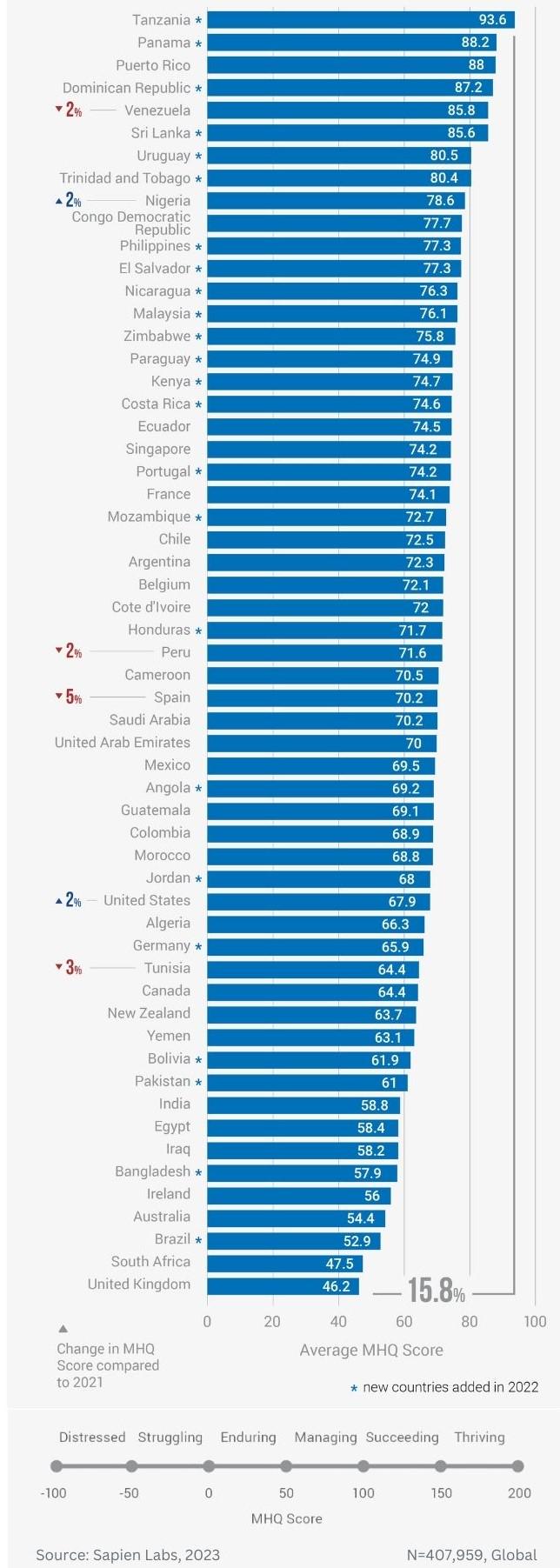
When actually studied rather than modelled, the Anglosphere, and especially its youth, ranks as the most depressed population on the planet. Tanzanians are the happiest. (N=407,959) Data Visualization
Data Analysis
What This Visualization Shows
This data visualization displays "When actually studied rather than modelled, the Anglosphere, and especially its youth, ranks as the most depressed population on the planet. Tanzanians are the happiest. (N=407,959)" and provides a clear visual representation of the underlying data patterns and trends. The visualization focuses on Whilst many self-reported studies directly asking questions regarding happiness often come to the conclusion that the global north is happiest, actual psychological analysis of subject populations show markedly different results; it shows that the most mentally stressed population on the entire planet is 18-34 year olds from the United Kingdom, and the happiest population on the planet are the elderly of Ghana. The Anglosphere scores extremely low on scores such as having a positive outlook, mental stability, friendships, and close family relationships, with a whopping 45% of youth in the Anglosphere being in debilitatingly severe emotional distress.
Source: extremely extensive study covering hundreds of thousands people all over the world; the Mental State of the World report, analyzes the mental wellbeing of different populations in a scientifically sound manner.
In contrast to the commonly cited and quoted 'World Happiness Report', by the United Nations which ranks countries on happiness by parameters such as wealth, life expectancy, GDP per capita, and social safety nets, the Mental State of the World Report analyzes the happiness of populations on an individual basis rather than as a model. It therefor produces completely different results. Do you think happiness should be quantified by the economic power of a nation rather than mental wellbeing?
The Mental State of the World report, which is the report in this post, measures mental wellbeing by the following parameters;
* anxiety * sadness * intrusive thoughts * social avoidance * anger * sleep problems * optimism * motivation * adaptability * empathy * creativity * focus
In contrast, the UN World Happiness report puts it's primary emphasis on GDP per capita, social safety nets, political freedom, and life expectancy. It adds these factors and using it models the happiness of nations. Some people argue this might be a flawed approach.
Source: [https://mentalstateoftheworld.report/wp-content/uploads/2023/02/Mental-State-of-the-World-2022.pdf](https://mentalstateoftheworld.report/wp-content/uploads/2023/02/Mental-State-of-the-World-2022.pdf), which allows us to understand complex relationships and insights within the data through visual storytelling.
Deep Dive into the Topic
Social and demographic data visualization provides insights into human behavior, population trends, and societal patterns that shape our communities. This type of analysis is essential for understanding social dynamics, planning public services, and addressing societal challenges through data-driven approaches.
Demographic visualizations often reveal important trends such as age distribution, migration patterns, education levels, and social mobility. These insights help urban planners design better cities, educators understand student populations, and healthcare providers allocate resources effectively. Social media analytics and survey data visualization can uncover public opinion trends, consumer preferences, and social movement patterns.
The power of social data visualization lies in its ability to make abstract social concepts tangible and actionable. By presenting complex social phenomena through charts, graphs, and interactive dashboards, researchers and policymakers can communicate findings more effectively and develop targeted interventions. This approach is particularly valuable in areas like public health, education policy, and social services planning.
Data Analysis and Insights
The patterns revealed in this visualization demonstrate the importance of systematic data analysis in understanding complex phenomena. By examining different data segments, time periods, and categorical breakdowns, we can identify trends that inform strategic planning and decision-making processes.
Statistical analysis of this data reveals variations across different dimensions that provide insights into underlying drivers and relationships. These patterns help identify areas of opportunity, potential risks, and key performance indicators that can guide future actions and resource allocation.
The analytical approach used in this visualization enables comparison across different categories, time periods, or geographic regions, revealing insights that support evidence-based decision-making. This type of analysis is essential for organizations seeking to optimize performance and understand complex market dynamics.
Significance and Applications
This data visualization has important implications for understanding trends and patterns that affect decision-making across multiple sectors. The insights derived from this analysis can inform policy development, business strategy, resource allocation, and operational improvements.
For analysts, researchers, and decision-makers, this type of data visualization provides essential insights for strategic planning and performance optimization. Whether addressing operational challenges, market analysis, or policy development, understanding data patterns helps create more effective strategies and solutions.
The broader significance lies in how this information contributes to our understanding of complex systems and relationships. This knowledge helps predict future trends, identify potential challenges, and develop more informed approaches to problem-solving and opportunity identification.
Comments
Loading comments...
Leave a Comment
About the Author

Alex Cartwright
Senior Data Visualization Expert
Alex Cartwright is a renowned data visualization specialist and infographic designer with over 15 years of experience in...