Strava collects the most data types linked to user identity Statistics
Data Analysis
What This Visualization Shows
This data visualization displays "Strava collects the most data types linked to user identity" and provides a clear visual representation of the underlying data patterns and trends. The visualization focuses on The Apps listed in the graph are:
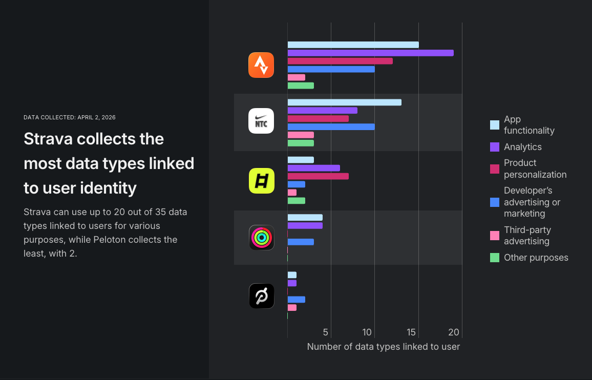
1. Strava 2. Nike Training Club 3. LADDER 4. Apple Fitness 5. Peloton
Personalized training is spiking in popularity, and so are AI alternatives that may be more affordable. But as technology promises to help you reach your goals, it also adds new risks to your personal information. This study uncovers the hidden cost of digital fitness — revealing that apps link the data they collect to your identity, track you, and now use it for AI training.
**Methodology and sources**
This study is divided into two main parts to explore fitness trends and the data collection practices of popular workout apps. The first part utilizes Google Trends to analyze search interest in “fitness” and “personal training” from January 1, 2022, onwards. This timeframe was selected due to enhancements in data collection since that date, allowing for a more accurate identification of global patterns and shifts in these topics over time.
The second part looks into how the five top workout apps for iPhone — Strava, Nike Training Club, Peloton, LADDER, and Fitness+ — handle data collection. These apps were selected from a CNET list² based on the largest number of monthly active users in 2025, as reported by Similarweb, with the exception of the preinstalled Fitness+, for which such data was not available. However, Fitness+ is likely used by most Apple device owners due to its default presence. We examined their data collection practices using information from the Apple App Store and reviewed their privacy policies for any details related to AI model training.
By combining these approaches, the study aims to provide a clear picture of current fitness interests and underscore the importance of data privacy in the digital fitness landscape.
[For the complete research material behind this study, click here.](https://docs.google.com/spreadsheets/d/1jcT8AH59i1f9vecif3TdwJ5F-XES7PJDx8SWvcI6e7Q/edit?gid=1270220469#gid=1270220469)
Data was collected from:
[Google Trends (2026).](https://trends.google.com/explore)
[Apple (2026). App Store.](https://www.apple.com/app-store/), which allows us to understand complex relationships and insights within the data through visual storytelling.
Deep Dive into the Topic
This data visualization represents a sophisticated analysis of complex information patterns that provide valuable insights into underlying trends and relationships. Data visualization serves as a bridge between raw numerical data and human understanding, transforming abstract statistics into comprehensible visual narratives.
The power of data visualization lies in its ability to reveal patterns, outliers, and correlations that might not be apparent in traditional tabular formats. Through careful selection of chart types, color schemes, and interactive elements, effective visualizations can communicate complex information quickly and accurately to diverse audiences.
Modern data visualization combines statistical analysis with design principles to create compelling visual stories. This interdisciplinary approach requires understanding both the underlying data and the cognitive processes involved in visual perception. The result is more effective communication of quantitative insights that can inform decision-making and drive positive change.
Data Analysis and Insights
The patterns revealed in this visualization demonstrate the importance of systematic data analysis in understanding complex phenomena. By examining different data segments, time periods, and categorical breakdowns, we can identify trends that inform strategic planning and decision-making processes.
Statistical analysis of this data reveals variations across different dimensions that provide insights into underlying drivers and relationships. These patterns help identify areas of opportunity, potential risks, and key performance indicators that can guide future actions and resource allocation.
The analytical approach used in this visualization enables comparison across different categories, time periods, or geographic regions, revealing insights that support evidence-based decision-making. This type of analysis is essential for organizations seeking to optimize performance and understand complex market dynamics.
Significance and Applications
This data visualization has important implications for understanding trends and patterns that affect decision-making across multiple sectors. The insights derived from this analysis can inform policy development, business strategy, resource allocation, and operational improvements.
For analysts, researchers, and decision-makers, this type of data visualization provides essential insights for strategic planning and performance optimization. Whether addressing operational challenges, market analysis, or policy development, understanding data patterns helps create more effective strategies and solutions.
The broader significance lies in how this information contributes to our understanding of complex systems and relationships. This knowledge helps predict future trends, identify potential challenges, and develop more informed approaches to problem-solving and opportunity identification.
Comments
Loading comments...
Leave a Comment
About the Author

Alex Cartwright
Senior Data Visualization Expert
Alex Cartwright is a renowned data visualization specialist and infographic designer with over 15 years of experience in...