TikTok makes opting out of AI training the most difficult for users Visualization
Data Analysis
What This Visualization Shows
This data visualization displays "TikTok makes opting out of AI training the most difficult for users" and provides a clear visual representation of the underlying data patterns and trends. The visualization focuses on **Methodology and sources**
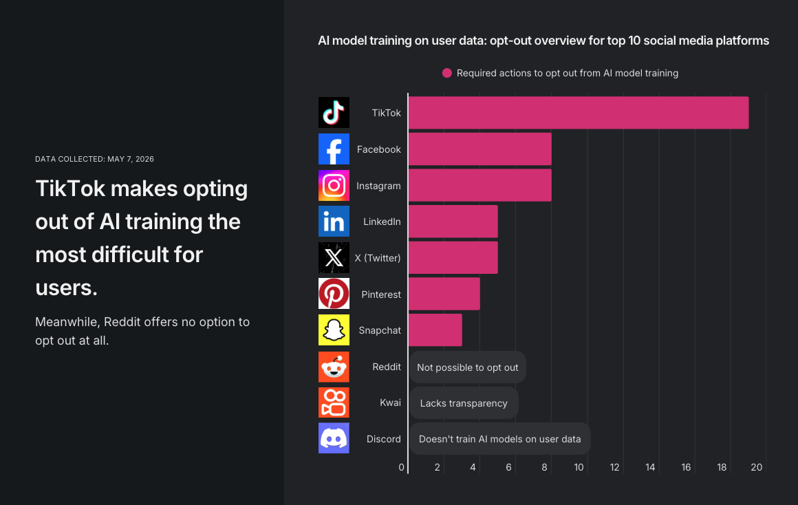
This study analyzed the 10 most popular social media platforms, ranked by Cloudflare's data on web traffic and user engagement. The focus was to determine whether users can opt out of AI training, what the default settings are, and whether opt-out options are available across regions. We downloaded the mobile applications for all platforms, with the exception of Kwai, which was not available in our region for analysis. For each accessible app, we assessed the default settings for AI training consent. Additionally, we attempted to opt out of the AI training process and quantified the difficulty by counting the number of actions required. An "action" was defined as a click, entering personal information, or toggling off consent buttons.
For Discord, Reddit, and Kwai, opt-out options were not readily identifiable within the apps, so we conducted a review of their official privacy policy pages to understand the companies' stated positions on AI model training. In the case of Reddit, we also noted publicly available information regarding partnerships with AI companies for data usage.
[For the complete research material behind this study, click here.](https://docs.google.com/spreadsheets/d/1jcT8AH59i1f9vecif3TdwJ5F-XES7PJDx8SWvcI6e7Q/edit?gid=814754763#gid=814754763) , which allows us to understand complex relationships and insights within the data through visual storytelling.
Deep Dive into the Topic
This data visualization represents a sophisticated analysis of complex information patterns that provide valuable insights into underlying trends and relationships. Data visualization serves as a bridge between raw numerical data and human understanding, transforming abstract statistics into comprehensible visual narratives.
The power of data visualization lies in its ability to reveal patterns, outliers, and correlations that might not be apparent in traditional tabular formats. Through careful selection of chart types, color schemes, and interactive elements, effective visualizations can communicate complex information quickly and accurately to diverse audiences.
Modern data visualization combines statistical analysis with design principles to create compelling visual stories. This interdisciplinary approach requires understanding both the underlying data and the cognitive processes involved in visual perception. The result is more effective communication of quantitative insights that can inform decision-making and drive positive change.
Data Analysis and Insights
The patterns revealed in this visualization demonstrate the importance of systematic data analysis in understanding complex phenomena. By examining different data segments, time periods, and categorical breakdowns, we can identify trends that inform strategic planning and decision-making processes.
Statistical analysis of this data reveals variations across different dimensions that provide insights into underlying drivers and relationships. These patterns help identify areas of opportunity, potential risks, and key performance indicators that can guide future actions and resource allocation.
The analytical approach used in this visualization enables comparison across different categories, time periods, or geographic regions, revealing insights that support evidence-based decision-making. This type of analysis is essential for organizations seeking to optimize performance and understand complex market dynamics.
Significance and Applications
This data visualization has important implications for understanding trends and patterns that affect decision-making across multiple sectors. The insights derived from this analysis can inform policy development, business strategy, resource allocation, and operational improvements.
For analysts, researchers, and decision-makers, this type of data visualization provides essential insights for strategic planning and performance optimization. Whether addressing operational challenges, market analysis, or policy development, understanding data patterns helps create more effective strategies and solutions.
The broader significance lies in how this information contributes to our understanding of complex systems and relationships. This knowledge helps predict future trends, identify potential challenges, and develop more informed approaches to problem-solving and opportunity identification.
Comments
Loading comments...
Leave a Comment
About the Author

Alex Cartwright
Senior Data Visualization Expert
Alex Cartwright is a renowned data visualization specialist and infographic designer with over 15 years of experience in...